Movie Tie-in Books Revealed
Posted on by Will

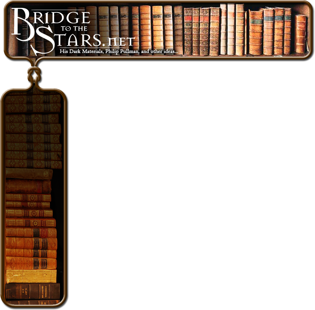
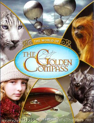
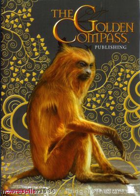
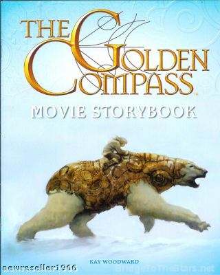
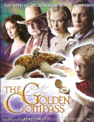
Several books tied-in with the upcoming movie of The Golden Compass are set to be released alongside the film and we’ve obtained images of their covers for the first time. On the film side of things, there’s a “Movie Storybook”, “The Official Illustrated Movie Companion”, plus “The World of The Golden Compass”. The fourth cover, of the golden monkey, may be the ‘movie edition’ of the book itself which is expected. These are not the finished covers and are more along the lines of design plans.

The covers are all below: click the thumbs to enlarge. “Images of the covers of the HIS DARK MATERIALS books published by Scholastic Children’s Books are reproduced with permission of the publishers. All Rights Reserved”


This entry was posted in Movie Publications. Bookmark the permalink.


29 Responses to Movie Tie-in Books Revealed

  1. Haley says:

    Oh!! These are absolutely stunning. This raises my expectations even more of the movie.

  2. aimee says:

    i especially like lyra’s expression on the fourth one.

  3. Mikayli says:

    Oooh, these look good, although I’m not liking the pictures of Dakota.

  4. Gabzie says:

    Wow, they look awesome. ^^

  5. hoobits says:

    Those are pretty damn ugly, IMO… What is up with that ice blue? I hope they aren’t finished designs. And oh yes… Lee’s balloon is a Star Wars ship. YAY.

  6. tari says:

    i find it slightly annoying that Pan isn’t in those pix, otherwise i think they look good

  7. Dukeleto says:

    Not impressed, typical film tie-in rubbish by the look of things, The Ozymandias pic is ok, and the running Iorek is a great pic, altho both covers are ugly, the other 2 covers are just awful.
    I suppose they have to make these things for illiterates who can’t be bothered to read the original books, don’t they?

  8. Marge says:

    Wow, apart from the golden monkey one which is kinda decent enough I guess, they look verrry cheap. “The World of…” and “Official Illustrated Movie Companion” look like an intern slapped them together in 5 min. Absolutely awful. The Iorek one is a nice pic, but a little plain. Back to… umm… school, Scholastic. And sorry for that crappy pun.

  9. Roxanne says:

    I totally agree with Marge. They look very unprofessional, like they were put together in Paint or something. I have a problem with the little black lines that are a part of the “Golden Compass” logo… hopefully they’re still being worked on.

  10. Gabe says:

    Um, yeah…design plans tend to be thrown together, hence why they are called “plans”.

  11. andria says:

    ew ew ew ew ew ew ew ew ew EW EW EW EW EW EW!!!!!AHHHHHHHHHHHHHHHHHHHHHHHHHHHHHH NOOOOOOOOO!!!!!
    that pic of DBR in the first cover is BAD BAD BAD!!!She looks so SICK AND TIRED!!

    apart from that the one of lorek running is good.

  12. Green Ink says:

    Apart from the one with the golden monkey this is all pretty bad. As a designer myself I think I can safely say that whoever did this needs to have his or hers computer taken away. Unimaginative, shoddy, simple plain ugly work.
    Even if they are unfinished sketches, none of it manages to convey anything that seems particular to the film and the book in question. It makes it look more like a lousy mid-nineties sci-fi tv-show.
    I hope Scholastic sees our comments, because this definitely needs to go back to the drawing board.

    On an another note, the balloon looks pretty, but completely and utterly impossible. Those two balloons can tear the gondola apart in a storm, and they’re not very handy when you need to be in the air quickly either.
    I know it’s a fantasy, but there is such a thing as logical thinking or even credibility.

  13. Lyra_B_S says:

    I-LOVE-THEM!!!!!!!! Especially the fourth one!!!!!!!

  14. Gabzie says:

    Dude, I have a hunch these aren’t even the finished product just a prototype. Geezus, I bet it’s gonna look loads better when its in stores. -__-;

  15. Witch_Queen says:

    Wow, These are totally awesome! I cant wait for the movie now! I’m not sure about Lee Scoresby’s balloon on the first cover though…

  16. drama queen says:

    is it me or has lyra have blue eyes?????

  17. Fulyasi says:

    I think Nicole Kidman’s face loks a little..blown up,if you all know what I mean. Such a shame.
    I don’t like the blue scheme,but I looove (!) the background and colour scheme of the second book. I always pictured HDM in earth colours,warm and dark and goldcolours.
    But perhaps,that’s just me.

  18. Lizzietiffon01 says:

    mint

  19. MeRcuryyy says:

    Fascinating, they are all fascinating!!But the fourth one isn’t so very well prepared, didn’t like the stars’ positions and glances…simply well done!!

  20. Amy says:

    Did any of you guys complaining actually read the part that said these were not the finished covers? It will be good to read negative comments when it is warranted not when you’ve been told that something will be changed or worked on and yet you go ahead and complain still. I mean, what is up with that? Read and then comment, don’t just stare at the pics, miss the point that was made. All the comments just become ridiculous. Complaining unnecessarily over and over is quite irritating.

    It takes alot of talent, time to come up with these things, a little encouragement and pat on the back is alot better than all these whining and complaining when some here can’t come up with any better going by what is in the fanart gallery. And I know everyone is entitled to an opinion but geez, try to be positive for one day!

  21. Diolmhain says:

    Oh god a movie edition of the book…

    I was quite enjoying it until then, i mean there’s no golden compass jokebook… but i always have hated movie editions of the book….

  22. Vampt Vo says:

    I think they look pretty good for prototypes, but I personally never liked the whole golden color scheme. Since I own the original British version of TGC, when it was called Northern Lights, the purple/blue color scheme representing the aurora always seemed more important than the gold of the altheiometer.

    It looks like they can make some decent material from these plans. And quit complaining about early design plans. They’re not the finished product. Geez, Internet critics…

  23. Alex says:

    need them all.

    now.

  24. Jess says:

    I’m a staunch book purist/snob too, but I think it’s silly to be upset about books like this being published. The originals are wonderful stories, from what I know the movie will be fantastic too and why not give children something more to stoke their excitement? I used to look forward to the Scholastic orders so much, even throughout junior high… if not high literature, this is good fun for imaginative kids. And who knows? Maybe someone will be inspired to pick up the series.

    The film’s artistic design is beautiful. As far as these? Relax. I’m excited that Newline is making the (first of three, hopefully) film. It’s a controversial storyline for the US market, like it or not. Let’s hope they stay true to the beautiful tale and not worry so much about preliminary soft-cover design.

  25. ppzjfdgsyf says:

    Hello! Good Site! Thanks you! xjppkaqyvgyf

  26. Kezmondo says:

    yeah lyras expression does look pretty wierd on the 4th poster. I hope she doesnt use expressions like that in the film. and also the 3rd picture looks like it was made in desktop publishing, even i could do better than that. hope these arent the finals but thanks anyway BTTS for posting them!

  27. marley says:

    the secons one is cute!!

  28. eliza says:

    Don’t judge a book by its cover. 😉

    But really, who cares, they are just movie tie-ins for fun. They are not supposed to be masterpieces like the actual books. I think they look fine for design plans.